Assignment 3 Landscape painting from mixed sources

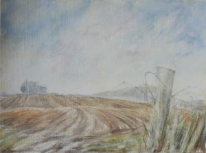
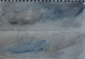
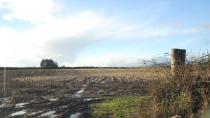
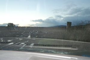
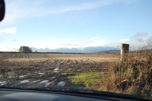
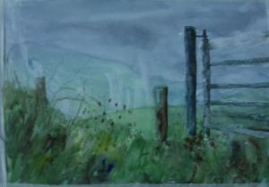
As a slight adaptation to the study I decided to concentrate on the scene during a brighter moment of my visit, using as reference three of my photographs, sketches and colour study. I think this was because the sun was shining at this time, from behind the trees to the left, hence creating more contrast of light and darks and I was interested at the time in trying to capture the group of tall trees in silhouette on the horizon/skyline and the sunlight falling on the field and fence post in the foreground. It also came with a bluer sky and lighter clouds.

DSC_2282assgt3 DSC_2283assgt3 prctce

However during the later stages I started to to realize, when I stood back from the painting  that in my efforts to obtain accurate perspective in the field’s  crop lines to give  a sense of depth and expansive landscape, the painting was starting to tighten up. I put a lot of time in to thinking about how best to approach this part of the scene and into practicing most of  the techniques but perhaps I thought about it too much. Whereas in my painted study, although it was done much quicker and spontaneously, i had considered and reserved the lighter areas of the field ie. the lines of straw stubble, applying them quite quickly and roughly using white wax crayon. I thought that while it did the job in one sense, it looked too light and too obvious and I was looking for something still effective but more subtle yet effectively convincing. On looking back at my initial rough notes, I noticed I had told myself not to overdo the details in the land as there is a lot of sky, somewhere along the line I seem to have lost sight of this.  All in all, comparing the study and the final painting from a distance my preference would be for the study with a few minor adjustments. This is  the trap I so often seem to fall into when it comes to assignments. My tutor did make suggestions to approach the assignment piece almost as though it is a study and I intended to take this on board. I know what I should be doing deep down, but somehow I allow a demon to take over and the rest is downhill. Perhaps  I will try at least another version.

DSC_2272Assgt3 shite

Version 1


The first version above, received a more drastic washing off than the second one and is even more faded out. But I also think because of the different paper that the paint didn’t soak in to it to the same extent. Perhaps also some of the colours don’t have as much staining ability as those in the second painting below. Again I think some parts of it would benefit from a little selective strengthening.

So, I did go on to do just that while thinking I must approach this one in the same spirit as the study, also giving myself a time limit of an hour, the idea being that this would lessen the risk of spoiling it.  In the end it took an hour and a half but this was less than half the time it took to do the previous one.

DSC_2279assgt3 skyland

DSC_2277assgt clouds

DSC_2275assgt3

Above – a few practice skies and land


Going to the other extreme of paper texture, I used Fabriano HP (smooth) this time.  Looking at a few watercolour landscape studies of Turner’s also gave me some inspiration, the sky particularly. I am happier this time with the second attempt, it is a looser composition and I prefer the colours.  Also, the sky and light have changed dramatically – rain clouds are looming over in the distance behind the clump of trees and the landscape is darker. I also lightened the trees and midground as I think they look too hard and dominant in the other version. The white wax crayon again came in handy to resist the paint in the lines of field stubble. I previously tried out a pale brown/orange wax crayon for this but the lines didn’t seem to show adequately, even when I practiced using dark paint over it.  I didn’t have any photos of the scene in front of me for this one, I think there may be a message there for me…. However I still prefer aspects of the study such as the trees and mid foreground – they look more spontaneous than either of the two finished paintings, which is I guess, going to be inevitable to some extent, although I think I have come closer to it in the second version. I am pleased that this one seems to a certain bleakness of the landscape, giving a sense of an atmosphere common in Ireland during the winter.

Version 2


Above = second version after washing off

The whole thing is more faded out after running under the shower and I think perhaps small parts of the foreground could be selectively strengthened. I do like that many of the thin wispy lines of tall grasses and brambles around the fence post still look relatively prominent, even those done with watercolour and the ones scratched into the paper are very dark.



Exercise 14 Photographs from source material

DSC_2196 DSC_2191ass 3 DSC_2190ass3 DSC_2189ASS 3 3


DSC_2199


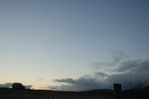
Above are five photographs I used as a reference for my assignment.


DSC_2201 DSC_2200 DSC_2199 DSC_2198 DSC_2197 DSC_2195 DSC_2193 DSC_2192


Above photographs also help to illustrate how much the light conditions changed during my visit of around one and a half hours.


ye

Exercise 13 Preparatory sketches

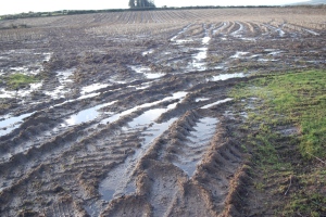
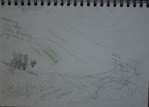
I parked the car in an open gateway facing south west into a large stubble field and across to a group of tall trees on the skyline in the distance and snow capped hills to the right further away. Other features of note were the parallel lines of crop stubble  going back to the skyline from tracks left by tractors around the entrance and puddles reflecting the sky. To the right slightly crooked  wooden post with brambles and ivy growing on and around it. Again – as with most of my paintings, these sketches and study were done during the middle to late afternoon. The weather was very showery and during the time I was there (about 1 1/2 hours) it turned quickly from bright sunshine to rain with a sky full of large dark billowy rain clouds. This and the cold temperatures, to me, were again not conducive to sketching outside so I stayed in the car. Also the fields were very wet and muddy so I wasn’t tempted to walk into it. The sky looked quite dramatic at times and I wanted to emphasise this and the parallel lines of stubble created by the agricultural activities. Also the trees and nearby field post were distinctive and interesting.

Ex 13 lines prep sketches Ex 13 lines prep sketches2 Ex 13 prep sktchs colour study Ex 13 thmbnls


I saw this view previously when I parked the car in the same place but at a different angle to do the study I didn’t proceed with in Building a picture (Exercise 8) of the previous project. So, since I was relatively familiar with the view I took along some wax crayon to depict the lines of stubble as resist areas and for the dead grasses around the post. It was just as well I did as the light toned lines glowed brightly against the contrasting dark earth.

There is quite a lot going on all in all, yet the combination adds up to a fascinating view which I felt worthy of a try. Looking at the individual elements I could visualize making a quite a number of variations on this theme and perhaps producing compositions focusing in on smaller areas such as the gate post area or the trees, including part of the field.

Exercise 12 Painting on the spot

I had high hopes for these two exercises, painting the same scene from a photograph and on the spot, as I think the composition has so much to offer. After taking numerous photographs of different views around the area – views that were practical enough to attempt from the car that is, this one stood out.  I was very pleased in this regard, as it appeared to contain elements that fitted together well while giving a message other than ‘look at this pretty landscape’.

One - part finished

One – part finished

I found that zooming in or out of the scene didn’t do anything for it. The only adjustments I made were to simplify a few details within.

After a previous visit, taking photographs of various views around the area, I returned to find that the road leading to it, which is a steep incline, was icy so I gave it a miss. The third time I went there I stayed for almost 2 hours – again in the car because of the cold. The weather and time of day were similar to when I  took the photographs.

While there I worked on two compositions. The angle I was at was lower than that on the photograph so everything looked higher and the gate and fence posts also looked bigger and more imposing. After lightly sketching it in, I could see that there were very bright areas of reflected light on the top part of the gate rungs and side of the posts, so to reserve these I applied masking fluid to the gate on both of them. Shortly after I noticed that (on the first version) I had also accidentally spilled some of it on a few other areas of the paper. While waiting for it  to dry, I started on the second. When I returned to the first I put down a layer of paint in all areas, then started to rub off the masking fluid. Before long I noticed that some of the paper was also coming off with it. Incidentally I observed that the areas where I had spilled the masking fluid partly resisted the paint, despite having removed it. I don’t know why this happened or why the paper came off on the gate, as this paper had stood up quite well on previous occasions to repeated applications of paint, water and light scrubbing.

The weather was showery at the time and heavy brooding rain clouds in the sky were interspersed by short spells of sunshine. As it was so changeable I decided to try and capture the view as it looked with the rain clouds approaching. The moody atmosphere looked more appealing.  Somehow I seemed to lose track of time until I suddenly realised that I had to go, unfortunately before finishing either of my studies. I think I must have spent too long studying and admiring the view, sketching them in and masking. When time is limited these are perhaps luxuries the likes of me shouldn’t indulge in.

The next day I finished off the foreground in the first version at home. As can be seen from the result, even though it was in shadow, I made it too dark and overworked it in a similar way to the painting of the same view from a photograph, so it would appear that it must have had some kind of influence on the way I approached this one. But the main reason is that I find I can’t seem to grasp  how to handle foregrounds like this one with a lot going on. For this reason I was sorry I couldn’t have spent ten minutes more with it on the foreground at the location, at least it would probably look fresher. In addition, before I made an attempt on the foreground I realize I should have darkened the tops of the distant hills a little and this may have helped to balance up the dark foreground.

One finished

One – finished

Consequently I decided not to do any further finishing on the second one at home as it seemed to defeat the object of completing a painting on the spot. On further study the second painting I feel that if any further work was to be done on it I wouldn’t want to do very much as the effect looks (particularly the foreground) so fresh and airy. I know it does need more work so, hopefully I will go back to the location before long and try to finish it within a strict time limit without messing it up.

Two - part finished

Two – part finished


Exercise 11 Painting from a photograph

ex 11 from phtograph

Part complete

1 How successful is this painting in terms of overall effects? The effect I wanted seems to have worked out. I like the way the man made large gate and the electric fence intrude on the countryside while the tree and wild grasses appear to be retaliating. the effect. I think there is just the right amount of them to give the desired effect, which would have been lost if I had zoomed in much further.

2 In terms of composition I think it is also successful. The sloping diagonals forming triangular shapes from background to foreground, link up and balance with the gate and the tree. The fence posts also act as a link between the gate and the tree.

3 The tonal relationships appear to work out okay as well as far as I can tell. Maybe the foreground grasses on the verge would look better  as little less dark. I made the hilltop lighter than in the photograph so as to give more aerial perspective. Perhaps the horizontal bars on the gate could be a little darks, then the foreground grassy area might not look as dark.

4 most of the colours appear to be quite true to the photograph, except the dark green in the foreground grass looks browner than on the photograph. Possibly the inclusion of a brighter green such as sap green would have helped.

5 The painting looks more finished and less spontaneous than a painting I would have made outdoors. The main reason being that I had more time to spend on it.

6 most elements are very much like the photograph apart from where I reduced or removed some detail from the hillside in the background and from the field behind the gate, as I decided there is enough detail in other areas without adding more when it was unnecessary.

7 Where the painting does resemble the photograph I think it is a bonus because that is what I wanted to achieve. I used a kind of shorthand to represent certain elements like the texture on the gateposts and the hedgerows and buildings on the hillside rather than trying to include every detail, which I would have been very disappointed about.

8 I had problems trying to emulate convincingly the pastureland behind the gate and the comparatively wild looking rough grasses on the banking in the foreground. For both I built up some texture in a few layers wet on wet and wet on dry. The foreground was most problematic and I used various tools such as a screwdriver to try and resemble darker grasses to the left but I couldn’t see how much I had overdone them until the paint dried. I think I  also went a bit too dark with this area. Most of the the area was in silhouette, I should have allowed for this and made it lighter to compensate.

9 I think it would have been a help to me if I had gone back to the same spot to check on the problem areas and done one or two quick studies of them in isolation before finishing the painting, to try and become more comfortable in handling them. The light conditions could have differed from when I took the photo so this may not have been a true representation of what was there at the time of the original phtograph, but the images from the camera to the computer screen to the printout may well also be out of balance so it really is a case of getting a result that one is happy with.

10 I knew my painting was finished when I became aware that if I tried to do any further fiddling with an area I would run the risk of making it look overworked. Unfortunately I  didn’t see it with the foreground until it was too late to successfully undo it.

11 Limitations of the exercise were that the only form of reference was one photograph and no other preparatory work such as sketches and colour studies were involved. I think working from a photo is good when it is only used as a back up to sketches and colour study, in order to check certain things.

ex 11 from phtograph complet


12 There is a big difference between working indoors from a photograph and working from direct observation outdoors – even from the confines of a car seat. I felt more relaxed painting indoors from a photograph as all one’s painting equipment is on hand and there is more time to plan what approach to take in relation to arrangement of tones, colours and other effects. One can take more time over things without having to worry about changing light,  approaching darkness or  worsening weather conditions etc.. However, I usually prefer most of all to work  from direct observation indoors on a still life or interior, for me this is more often than not the best of both worlds.

Exercise 10 Painting with prepared elements

1 As the instructions asked to build up the majority of layers slowly, allowing one to dry before adding the next, I got the impression that the idea was to do a controlled painting. Having rearranged certain elements a little in some way helped in my decision to base the painting on  the  zoomed out drawings. I would say I have followed closely my two first and last drawings, apart from adjusting or adding a couple of  elements in the final drawings, which is thanks to the intervening investigations.

DSC_2116Ex 10 Ptg with prpred elmnts

2 The preparatory drawings were helpful in this regard, as I could then test out various compositions, tonal and otherwise, hopefully making it easier to identify a visual balance .

3  As well as the above the drawings  were useful  to focus in on trying out  details, which gave me confidence  and a stronger sense of direction when I approached the painting.

4 I tried out the horizon line (top of the wall) both lower and higher in the quite  composition but neither worked out as the building’s impact seemed to be diminished. the main thing that bothers me about where it  is now is that, although it has a slight diagonal slope, it is mostly around half way up the page which perhaps tends to divide the paper in half.

5 As far as the colours are concerned, I found the grids from the mixing greens exercises influenced many of my colour mixes as much of the building, sky and foliage were blue, green or pale yellow/green. the other colour , even though they are hard surfaces of building materials, tend to be earth tones they aren’t so far removed from hues and tones discovered in the mixing green exercises.  After trying a few colour samples I ticked off those I chose to use. The trickiest part, I found, was the wall covering a large area of mid to foreground – I wanted to vary some of its colours a little from the others.  I added some extra maroon and yellow ochre but the maroon seemed to overpower  the other layers of colour causing a disjointed look, so I added some blues from the building, wall and sky, which although still noticeable, is now a bit more subtle.

After cropping along lower edge

After cropping along lower edge

6The tonal arrangements seem to have worked out to my liking eventually. The previous two tonal drawings helped in this regard, but I also darkened the sky in the painting, particularly the clouds which appeared to be threatening rain, this is how I saw it at the time. I think this contributed to conveying a slight air of foreboding, something I like, and has helped to balance  the tones with the hedge running along the bottom of the picture. Initially this seemed to interfere, even take over other elements, as it looked too dark in relation to them, so I toned this down by washing off the paint using a brush wetted with water. and cropping the lower edge a little.

7 However I do still think that  detail in the painting looks a bit too exacting for my liking and I would like to break away slightly from it when there is an opportunity.

8 As mentioned earlier, I didn’t strictly follow the apparent emphasis on building up tones slowly wet on dry throughout the exercise as it felt too constraining. I would like to try a much looser more spontaneous version.

9 It has helped me select the right subject by improving my understanding of it by doing the preparatory work increasing the chances of spotting problem areas and dealing with them early enough in the process. It also may help generate ideas for possible further future exploration of the subject.

10 Yes, by placing in different arrangements, sizes and numbers helps to show up what may and may not work in combination.

Later washed off some areas.

My tutor said in his report that this painting could benefit from much lighter uses of watercolour by soaking and reworking detail of certain aspects. I did do the first part but didn’t get round to reworking any detail as yet, so will bear this in mind for future attention..