Because of the cold changeable weather I completed these studies over a few visits.
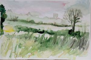
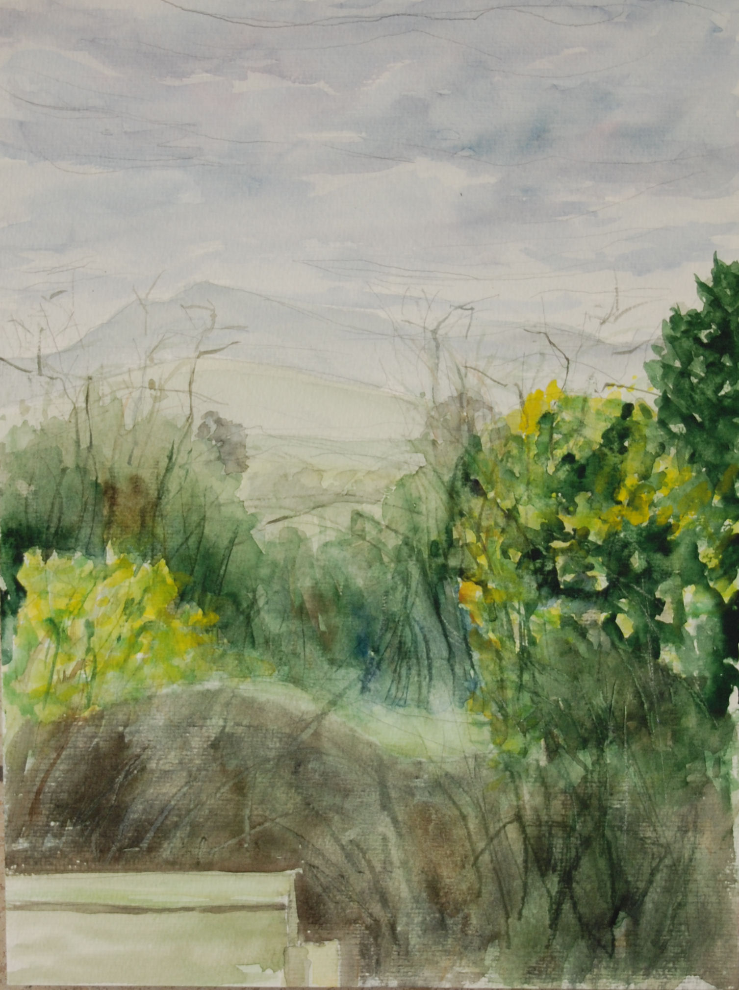
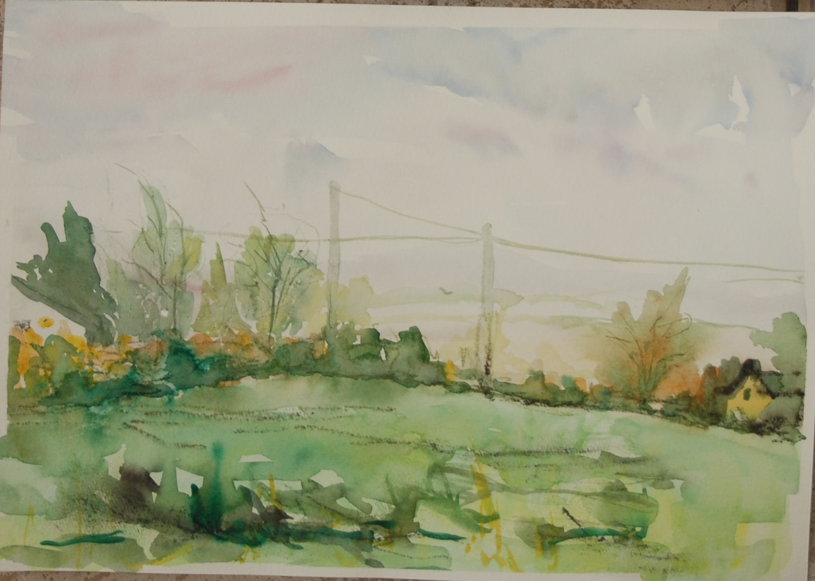
1 The attraction of the first viewpoint was: the sky at this angle and time of day (approximately 3.30pm) was bright with glowing reds in the drifting clouds. Also the buildings in the distance, including the water tower, formed interesting shapes on the skyline of the hill, as well as the two rows of hedges. The tree I moved in from the right to help frame the scene and counterbalance the edge of the large dark hedge to the left. From my low viewpoint on a folding stool I also liked the dominant look of the long grasses along the wire fence from middle to foreground.
2 What aspects of the landscape did I feel were most important? The shapes of the buildings on the skyline, the right hand tree – I’m not sure if the left hand hedge is necessary, and the tall grasses in the foreground.
3 What special qualities does my chosen landscape possess? Most obviously for me was that it was so convenient, being a field next door to my house. I didn’t have to drag my equipment very far and I could put it off for another day when the cold became too uncomfortable, as it did. Also there are a variety of features to be seen from each angle possessing between the four views a gate, telephone and electric posts and cables, buildings – mostly houses and farm buildings (in the distance), hills in the near and far distance, trees in the mid ground, fields and hedgerows. There was no disturbance from people or passing traffic.
4 The first study compared to the last one – though i didn’t feel quite as much in control of the paint in the first one and the paint was applied very wet in wet in most places, I prefer this one as to me it looks more spontaneous than the second. The second, to me, looks overworked in places – along the hedgerows and too fussy especially the sky with the other elements, although I like the way the paint dispersed (after it got rained on), the rest of the composition would probably benefit if I played the sky down more. The sky should really be visible through the branches of the tree but it isn’t, the outlining of the branches and the white paper underneath tend to give it a halo effect. The first version in comparison looks much calmer around the skyline and sky area for the above reasons and I think this is to its credit as although I like the reds of the buildings and the wet on wet paint, the red appears to pull them forward to some extent, interfering with the look of recession, although they also seem to work as a focal point.
ONE
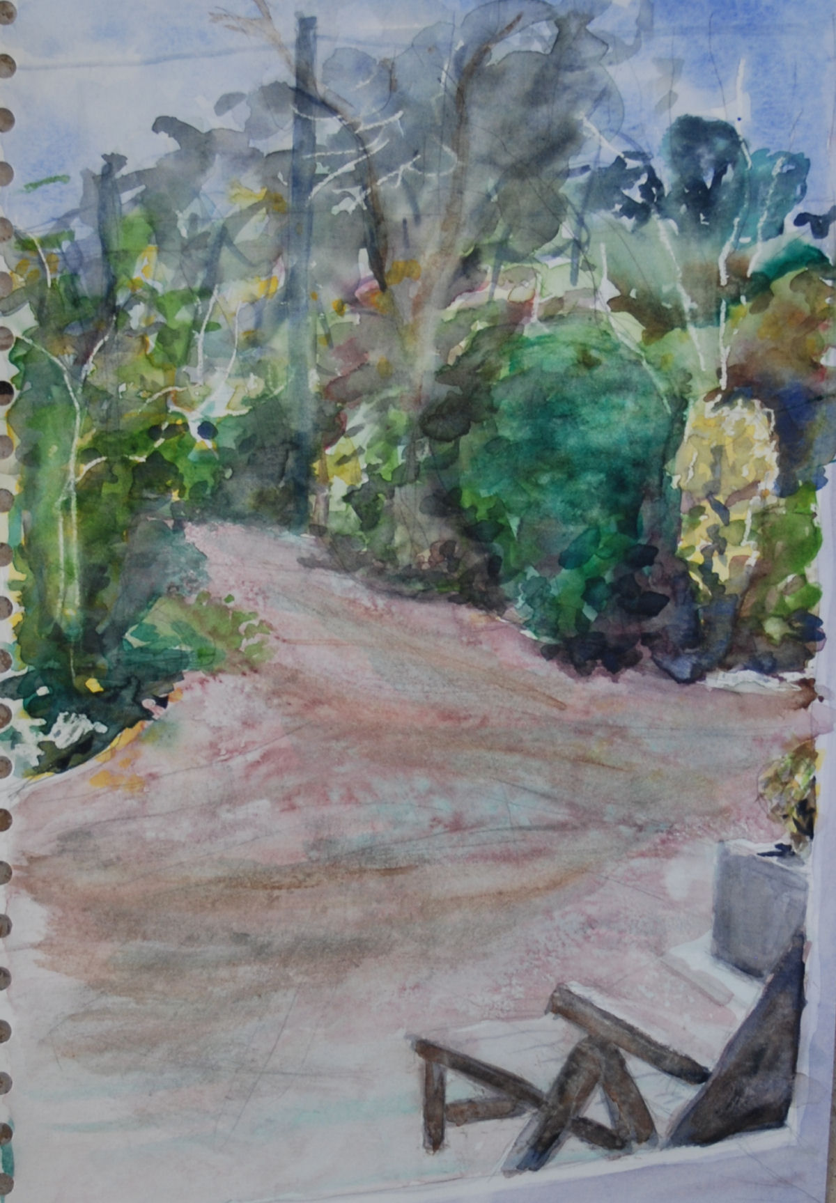
5 Changing light – was awkward at times as it would throw areas in and out of silhouette depending on whether the sun was out and how far it had moved round while I was there. Before long I started to get the habit of making a decision to stick (more or less) with how a scene or part of a scene looked at a particular moment in time, for instance the buildings on the hill went into silhouette more than once so I decided to keep them light to help them recede into the distance.
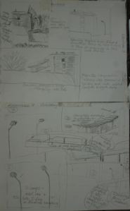
6 Describe the problems and any unforeseen advantage in moving on to the viewpoints that I didn’t choose: I found it necessary to move a few elements around to help the compostions of numbers 2 and 3. The weather changed rapidly during number 3, it started raining all over my painting while the paint was very wet turning it into a bit of a puddle. I tried to define some more detailed elements with ink but it ran on the tree branches. Then I tried waterproof ink but this looked hard in relation to other areas. I did a second version of number 2 because I wasn’t happy with the first as it looked a bit sloppy despite my efforts. However number 4 seemed to work out much better. The view, surprisingly, became more interesting as I painted it and I didn’t see a need to adjust very much. I added a few ink lines to it but they don’t look so obvious or messy as in 3.
TWO
THREE
7 Was it harder to work on these scenes? If so say why? On number 3 it was, as the weather was windy and showery, then it started to rain heavily soaking my painting. Other than that it was reasonably okay apart from feeling very cold after a while of sitting around in one spot. There were a couple of occasions when I would have had a problem protecting my painting from being blown away by the wind if there had been more than one or two.
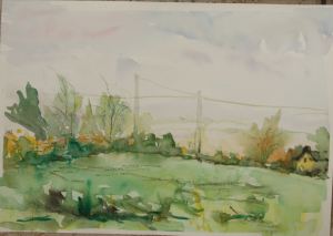
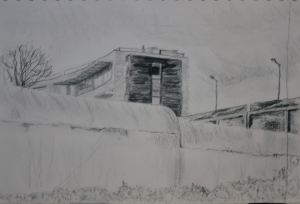
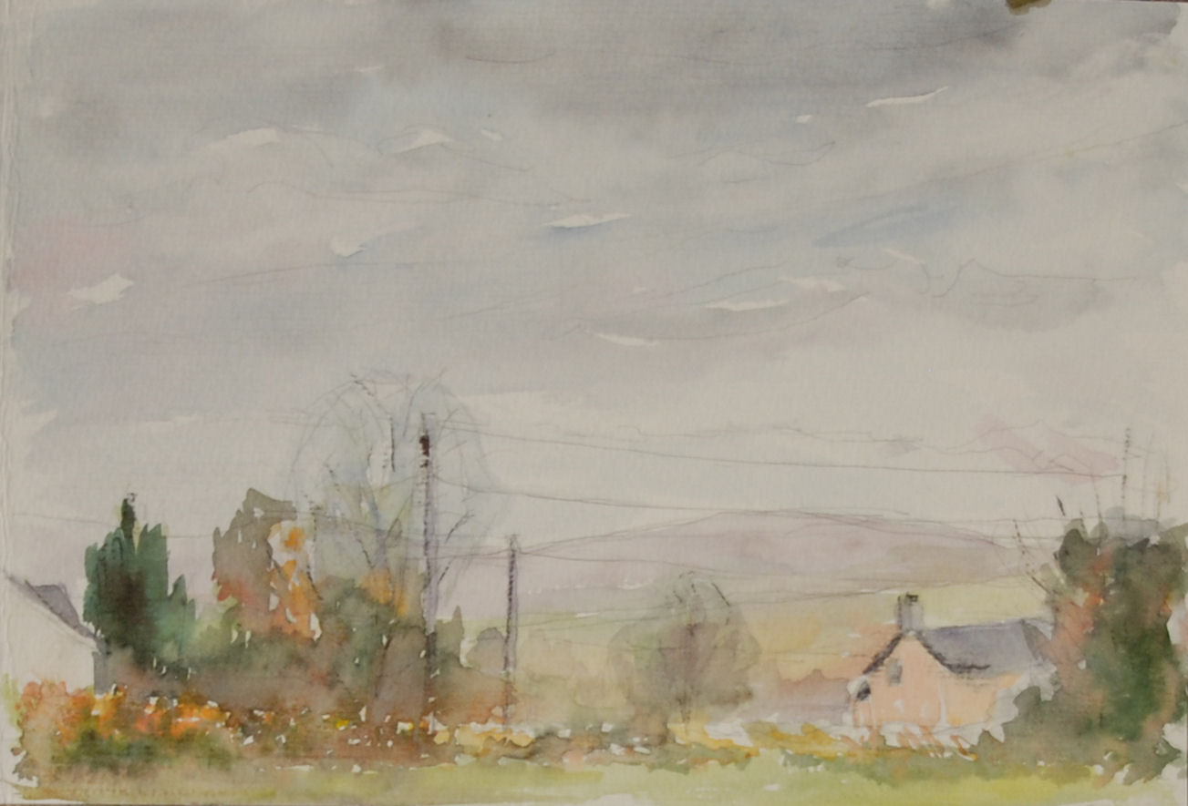
8 Looking at all of the watercolour paintings in this exercise and trying to assess which have worked best and why: I think I was more in control of the handling of the paint in number 4 than most of the others and I like the view but it had the look of just another landscape. Whereas number 5, which I wasn’t keen on at first, has grown on me. It contains some interesting elements eg the buildings to the left and right and the utility posts (I adjusted their position) the variety of trees and foliage (I edited some of them out), directional lines and pointers set up by the utility cables and the tiny point on the edge of the roof of my house to the left. They also seem to give it that lived in look rather than a twee countryside scene. I think there is a good general balance with the elements leading the eye around the composition. There are also quiet areas to rest the eye. The large sky is relatively quiet as well and doesn’t fight for attention.

FOUR

FIVE
9 The aspects of my work I think I need to develop more are to learn to sketch more quickly and successfully than at present, although I don’t think it will be easy. I think my main problem areas are often trees and foliage. Many of the tips I pick up from books and online often seem to be forgotten in my haste to complete things within a given time, it is just something I will have to become more familiar with as time goes on until, hopefully, these things will become almost second nature.
10 What have I learned about what to include and what to leave out? I don’t think the crows help in number 4 but I felt the need to include them because there were so many flying around at the time. As I progressed I began to see details in the landscape that I judged to be unnecessary and probably would detract from the composition so I left the out. However there are still some features left in that I wouldn’t use again in combination, such as in sketch number 6 which as already mentioned is too fussy.
11 How could the exercise help me find a place to paint in the future? The idea of going very far afield was quite off putting because of the cold weather and relatively short hours of daylight at this time of year (autumn) but for this reason, as it’s turned out, I think ironically the cold weather worked in my favour. At first I thought the views were quite uninspiring, partly perhaps because they are so familiar to me, but now I look at them differently. It’s reminded me that it isn’t necessary to locate ‘that perfect view’ to find something interesting to paint – it’s practically everywhere.
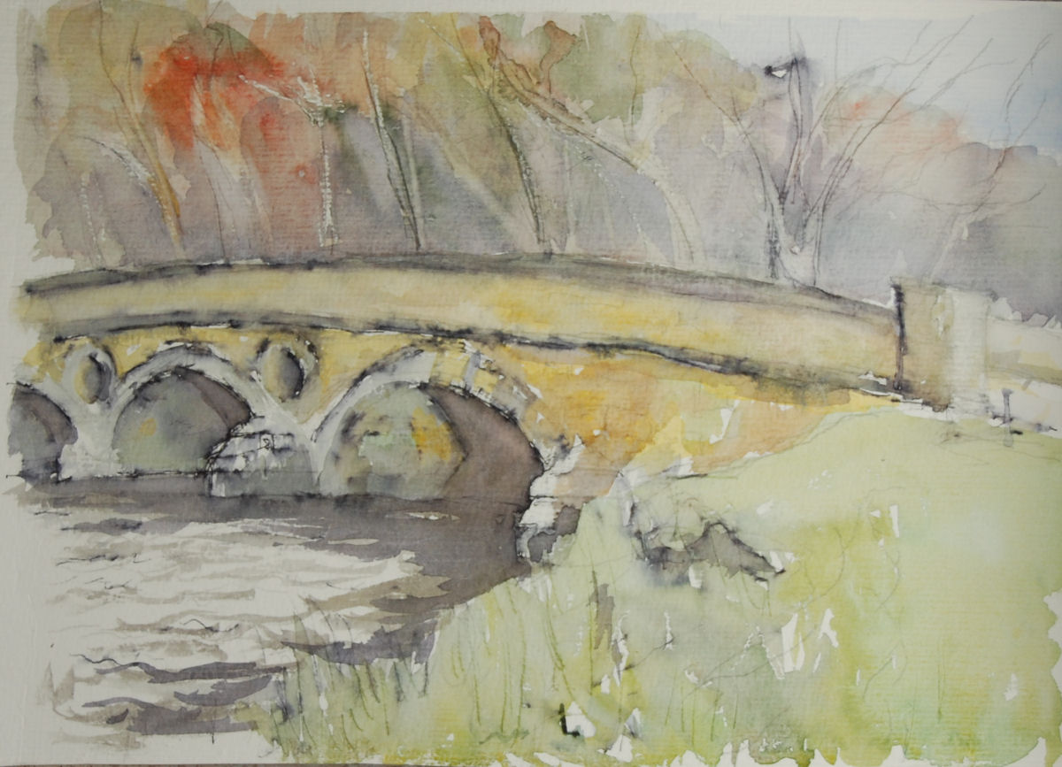
 approach road was flooded. A roadside study in the car from a distance was as much as I could muster, but because of showery weather building details were lacking and other features seemed to take over – road, trees, hedgerows, hills, the buildings becoming just shapes far away. I wasn’t satisfied with my results, both technique and subject wise.
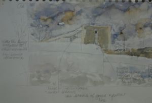


