

mixing greens 1(2) on A4 cp paper
Exercises 4,5,6 and 7 Mixing greens
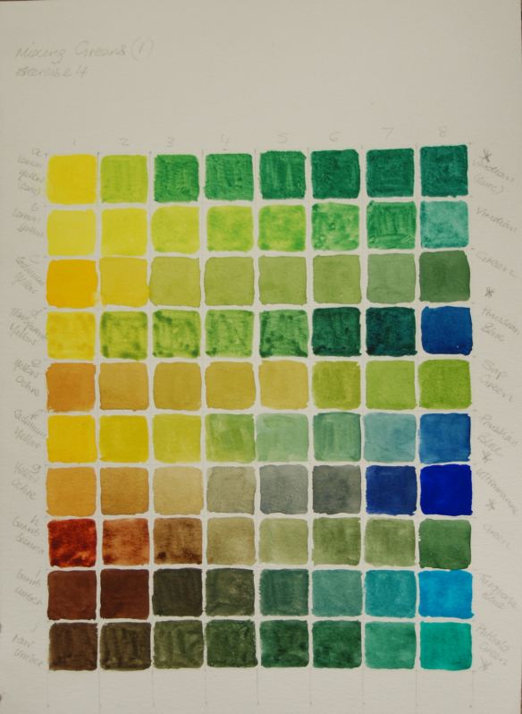
Mixing greens 1,2,3 and 4
mixing greens 1(1) on A3 140lb cold press paper
mixing greens 1
Certain points of note when in the process of doing this exercise were that, apart from discovering a good number of natural looking green hues, it was interesting and illuminating to see how an opaque pigment affected a transparent one such as opaque yellow ochre with transparent ultramarine. These colours combined also produced beautiful granulated blue and dull yellow tinged greys.
The green labelled as just plain ‘green’ from my artist’s quality St. Petersburg pan set, I would estimate it to be the same as or very similar to Hookers green when comparing with charts on the internet. This is my favourite green for landscapes as it is strong, versatile as looks natural alone or when mixed.
I enjoyed this exercise so much I went onto a second sheet and could have carried on.

mixing greens 2

Mixing greens 2
Mixing greens 3
I think I was fortunate that I read through the second exercise of bottle still life compositions aswell as the first before making a start, as the first exercise seems very short on explaining the second method while going into great detail on the first. The method is not described until the next exercise.
I’m still not sure if I interpreted the instructions as intended but I certainly used two very different methods to achieve the desired depths of tone and colour, similar to the exercises using tones in several layers and tones from a single layer in Part 2.
I used two different methods as follows:
- As per guidance notes – on the first bottle the tone was built up in several layers with a fairly weak mix of Prussian blue and transparent yellow. A red toned reflection was creeping in so I added this using a weak light red.
- I understood this method to be using a single layer of adequate strength pigment to obtain intended results. This is a much more olive toned bottle than the first. After masking the very lightest areas I started with a mix of yellow ochre and a touch of viridian in the lighter areas where there were reflections from the blinds behind, adding more viridian towards the mid tones. Mixes of viridian and burnt umber predominate the darker areas. The only other mix included is viridian/perylene maroon. Some neutral tint was added to the mix for certain areas in the labels. The depth of tone did build up quicker than on the first bottle as there was no layering (left) and there is more variety and depth of colour as a result.
The simple background was put together mostly using complementaries from opposite (or almost) sides of the colour wheel.

Mixing greens 3, version 1
Mixing greens 4
For the next composition containing four bottles I again used the same method as the second bottle of the previous exercise, strengthening a pale colour adding slightly more pigment and darkening by using ultramarine/Prussian blue and phthalo green/burnt umber or crimson, another dark earth colour and complementary. Other complementary colour mixes included phthalo green/cad orange, viridian/yellow ochre– both quite pale, Prussian blue/light red – for darks in far left bottle or cad orange or yellow with possible addition of burnt umber and Prussian blue and burnt umber/viridian – on right side three bottles.

Mixing greens 4, version 2
Amongst this selection there a preponderance of opaque colours such as the cadmiums, ochre and light red which I think helped to build up the tone fairly quickly. Cadmium yellow and cad yellow/yellow ochre was good for the light reflections from the light behind. Most burnt umber used in second bottle from left as it is the brownest shade. The two browner bottles also contain indigo/burnt umber.
I thought it was important to include details of what colour mixes I used as the purpose of the exercise appeared to be about how to build up colour and tone using different methods and a variety of suitable colour mixes. The perspective may not make sense in places as I sketched in the object shapes during daylight where they were place on a window sill at a lower angle from the one I moved them to. When I painted them it was on the table in front of me at night time. At the higher angle they were positioned in front of an artificial light source, just enough to give off an interesting mellow glow behind casting long shadows to the front. Also the table edge echoes the ellipses of the bottle’s bases.
